
5 Eye Shadow Colors That Influence Attention in Photos or Meetings
Annanya Saxena | Aug 23, 2025, 11:11 IST

( Image credit : Timeslife )
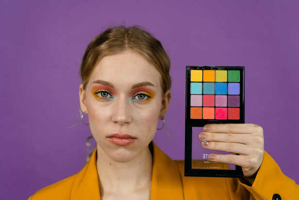
Eye shadow shades can change how people see you in photos or meetings. Soft brown or beige creates a natural and calm look. Blue or green shades draw focus and make eyes stand out. Gold adds warmth and can highlight the face in photos. Grey or silver shades add depth without looking too bold. The right choice depends on setting. In work meetings, neutral tones show trust. For photos, brighter shades guide attention to the eyes. These small choices can shape how others notice you.
Many people struggle to look confident in photos or meetings. Clothes and hair matter but eye makeup also plays a role. Eye shadow can change how others see you. The wrong shade may make you look tired. The right one can make you look sharp and alert.
We live in a time where first impressions matter. Photos are shared online. Meetings happen on video calls. People want to be noticed but not in the wrong way. Using the wrong colors around the eyes can reduce impact. You might look dull even when you feel full of energy.
Eye shadow is often seen as only fashion. In truth it is a tool. Colors can draw attention shift mood and highlight your best features.
Here are five shades that influence attention in real ways.
Brown is simple and natural. It gives depth without looking heavy. In photos it warms the eyes. In meetings it makes you look calm and steady. A light brown on the lid is enough to add focus without being too bold.
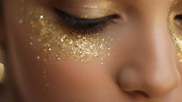
Gold reflects light. It brings a glow to the eyes. On camera this shade makes the eyes look open and awake. In meetings gold signals energy. Use it in small amounts on the center of the lid or inner corners.
Blue adds contrast. It works well for people with lighter eyes but can also make brown eyes pop. In photos it draws instant focus. In meetings a navy shade gives a sharp and serious feel. Bright blue is less formal but can work in social settings.
Green is fresh. It gives a lively touch without being too strong. A soft olive green can make eyes look brighter. In photos it adds a natural glow. In meetings it gives an impression of balance.
Purple adds depth. It works on all eye colors. In photos it creates a bold effect. In meetings a deep plum can add authority without being harsh. Lighter purple shades give a playful look for casual events.
A 2017 study in the Journal of Fashion Marketing tested how makeup colors affect perception. Participants judged faces with gold and brown tones as more trustworthy and approachable. Bold shades like blue and purple drew attention faster.
Eye shadow is more than color. It is a tool to guide how others see you. Brown shows balance. Gold shows energy. Blue draws focus. Green adds freshness. Purple gives depth. Choosing the right shade can change how you look in photos and meetings.
What suites you
eyeshadow palette
( Image credit : Pexels )
We live in a time where first impressions matter. Photos are shared online. Meetings happen on video calls. People want to be noticed but not in the wrong way. Using the wrong colors around the eyes can reduce impact. You might look dull even when you feel full of energy.
Eye shadow is often seen as only fashion. In truth it is a tool. Colors can draw attention shift mood and highlight your best features.
Solution
Brown
Brown eyeshadow
( Image credit : Freepik )
Brown is simple and natural. It gives depth without looking heavy. In photos it warms the eyes. In meetings it makes you look calm and steady. A light brown on the lid is enough to add focus without being too bold.
Gold
Gold eyeshadow
( Image credit : Pexels )
Gold reflects light. It brings a glow to the eyes. On camera this shade makes the eyes look open and awake. In meetings gold signals energy. Use it in small amounts on the center of the lid or inner corners.
Blue
Blue eyeshadow
( Image credit : Pexels )
Blue adds contrast. It works well for people with lighter eyes but can also make brown eyes pop. In photos it draws instant focus. In meetings a navy shade gives a sharp and serious feel. Bright blue is less formal but can work in social settings.
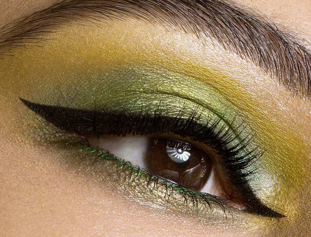
Green
Green eyeshadow
( Image credit : Pexels )
Green is fresh. It gives a lively touch without being too strong. A soft olive green can make eyes look brighter. In photos it adds a natural glow. In meetings it gives an impression of balance.
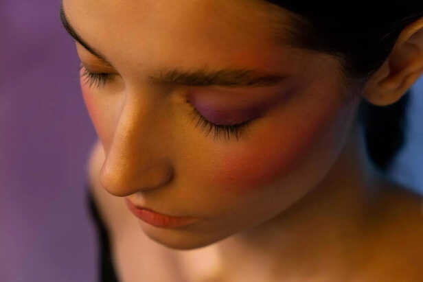
Purple
Purple eye inspo
( Image credit : Pexels )
Purple adds depth. It works on all eye colors. In photos it creates a bold effect. In meetings a deep plum can add authority without being harsh. Lighter purple shades give a playful look for casual events.
Case Study
Takeaway
Let us answer Thoughts coming in your mind before starting,
- Which shade is best for work meetings?
Brown or navy blue. They look sharp but not too bold. - Do these shades work on all skin tones?
Yes. The depth of shade should match your skin tone. - Which color works best in photos?
Gold is most effective. It reflects light and brightens the eyes.